POOJA KAGRANA
ILLUSTRATION
RE-STORY
THE HANDMAIDS TALE
As we started to study The Handmaid's Tale which is a work of speculative fiction by Canadian author Margaret Atwood the first information could guess was it could be a feminist. Before reading the book I researched about the book which felt to be quite a dark story in the beginning but then later realized it was quite a simple storyline about a messaged to be told about the scenario in Gilead period.


We started this project by a table top tableau workshop, where we were given the first page of the book and where supposed to interpret the book using the content page the front back and the script given. The text was quite informative- we learned quite a lot of the atmospheric feel of the story by that page.
we also found a unusual format to the chapter names- which was very interesting. The group decided to work with this information collected.
Using the information, we learned from page one, we decided to collect and give the look we understood.
We distributed work amongst ourselves to get work going. This week was quite basic but it was mainly about researching and going deep in about the culture of the book. Knowing it being such a famous tale we found a lot of supporting information on the internet which gave us a start.
We made paper garlands, beds, basketball court to as the data we collected of the first page. Also going through the book we found something usual was the title description of chapters. There was quite a repetition of the title night. So we tried to play with the titles and checkered flooring that we studied from the first page.
TABLE TOP TABLEAU WEEK 1


THE FINAL TABLE TOP TABLEAU OUTCOME WEEK 2


I was really satisfied with the end result of week 2 work. We were able to give it gymnasium feel with using various elements like the stairs and basketball court line, aligned messy beds, checkered flooring with the chapter titles printed on them to show difference and focus on the word night. We wanted to follow a color scheme that included black white and red.
Our goal was to show disturbance in a very simple way where something like gymnasium which is to be organized was messy using the same first page from the earlier workshop. We also included a hanging post to show seriousness and dark side to the story.
We also had a Red cape (handmaids dress) which appeared torn and disturbed with
writings over it. The initial idea to this was to have a cape that looks perfectly fine from outside to show how handmaids are forced to behave in a certain manner but the inside of the cape has all these unspoken thoughts and complains and worries that they feel helpless to share. Their screams that are muted. But then the scratches and disturbed rips on the cape were suggested by more to explain or convey the pain.
To support all the other things, we also had a clip from the film handmaid’s tale that spoke and gave an idea to the audience about the pain and the helplessness was present in the story.
At the end our presentation conveyed exactly what we wanted it to convey, this week work made us really want to know more about the book and the surroundings of it, we were ready to experiment with materials and things for the following week.
TEXT AND SOUND WEEK 3
Kruger
Artist that I looked into for this was Kruger’s self-entitled exhibition at the Mary Boone Gallery in 1991, which is a large-scale installation where text and images are directly placed on the walls, ceilings, and floors. The enclosed space immerses the viewer with messages and graphics that utilize the energy of the architecture to enforce Kruger’s message. The text on the floor is a bold white on a red surface.
Kruger’s work, in this case, speaks directly to the viewer via the surfaces of the interior, instead of her previous work that primarily was based in two-dimensions. Although she has changed the medium for her work, she continues to use her characteristic red, white, and black color scheme, bold typeface, and simple graphics that we have seen in her previous work.


The other interesting thing I came across was a piece directed by Ayşegül Kantarcı in Istanbul about A text discussing about the threshold on ethics and morality was looping on the floor, people who step on the typographic area to read it, realize them selves on the wall and the interaction process starts. everything that’s legal is not always fair. Everything that’s fair is not always legal.
Other explored sources include the following photographs


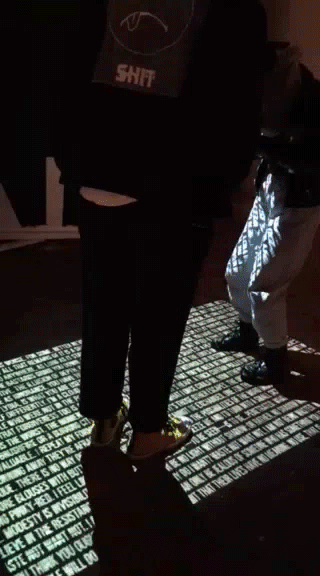
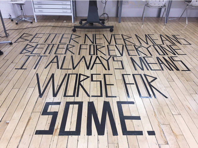
By this point in the project, we were quite pleased by doing floor typography after looking into such amazing work. We decided to use the wooden flooring of the studio as our gymnasium floor and having a quote of the book that can summarize the story in a different way. The quote we used read “Better never means better for everyone it always means worse for some.”
By this point in the project, we were quite pleased by doing floor typography after looking into such amazing work. We decided to use the wooden flooring of the studio as our gymnasium floor and having a quote of the book that can summarize the story in a different way. The quote we used read “Better never means better for everyone it always means worse for some.”
We also thought of making an animation along with it to show captivity and no freedom. We wanted to show how mute the handmaids felt. We also added the title checkered graphic that we had been using from the previous weeks to show continuity and a message. We tried to follow the color scheme black and white.
We created also created a wall print of a coded message that handmaids would have been speaking to each other with. We tried to use numbers as the alphabets to each character. The reason behind this was again to show communication under the line. The message here was the same quote we wrote on the floor.


FINAL OUTCOME

EVA HESSE
Eva Hesse a sculptor, known for her pioneering work in materials such as latex, fiberglass, and plastics. She is one of the artists who ushered in the post minimal art movement. She was who regarded painting not as a two-dimensional surface, but as an object on the wall to be extended into the space of the viewer before it. Much of Hesse's work might be thought of as a form of poetic, three-dimensional montage, a touching of different parts removed from various sources and combined, or arranged in ways that suggest moments of quiet reflection on the world around us.


Ideas and concepts
I was very interested in doing something different after looking deeply into a lot of work created by different artist around for handmaid’s tale and similar topics. Eva Hesse’s work inspired me to think differently to this story. The week 3 presentation was very successful in our head we had already thought of exploring within type for the exhibition, but we still explored into it.
Before finalizing what we had to do, our idea was to create a cage and have a dummy in the cage showing absence of freedom and having plaster or mud hands all over seeking help.
Ideas and concepts:
I was very interested in doing something different after looking deeply into a lot of work created by different artist around for handmaid’s tale and similar topics. Eva Hesse’s work inspired me to think differently to this story. The week 3 presentation was very successful in our head we had already thought of exploring within type for the exhibition, but we still explored into it.
Before finalizing what we had to do, our idea was to create a cage and have a dummy in the cage showing absence of freedom and having plaster or mud hands all over seeking help.
Method and Materials:
Before starting the final piece, we decided to do some experimenting within the animation that’s to be projected on the ground. About the lighting of the space and how to follow the color scheme that we have been using for the previous weeks. The final idea was to project moving text on the ground.
Exhibit/Installation – Final Outcome:
For the final piece we decided to have the projection of text on the ground and also have the code message that the previous week had to go along the projection. This time rather than using number the idea was to have various alphabets showing no meaning. The message to be spread using that code was that even if they scream their pain out to people listening was not going to help, unless you come closer and feel the exactly same pain they were facing will be when the message would be conveyed.
Other idea for the text was repetition of the word or letter to show how all handmaids had the same pain but different conditions of complains. To show this we had in mind to use different font size and texture to show the intensity of the same letter or word.


Re-story Final Outcome